From Summer 2022 to Summer 2023 is how long it took me to watch all of Game of Thrones, but with my recent recall of most of the series, I saw it very fitting to look at this very colorful connection of characters in this network analysis blog post. The nodes in this graph represent the characters in GoT, and there are 407 in total! The edges represent the interactions between certain characters. The nodes themselves are sized based on PageRank centrality, which, as Google tells me, is a tool that measures the importance of a node in a network. The nodes are also colored by communities within the show, and the thickness of the edges represents the number of interactions between certain members.
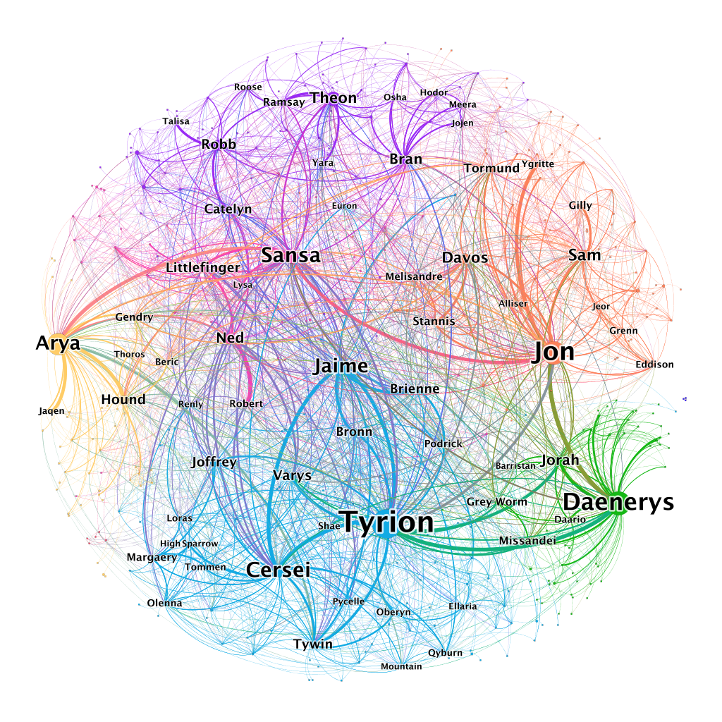
This version of the graph may have been overwhelming, so our author only included about 1/10th of the labels of the nodes. So, despite how many interactions are displayed is actually quite a legible mapping of a network. The relationships were made by analyzing the script of the series:
“We processed the scripts, adding a link between Character A and Character B when:
- They appear in a scene together
- They appear in a stage direction together
- They exchange dialog
- Character A mentions Character B
- Another character mentions Character A and Character B together.” (Network of Thrones)
This was all made into a fun network by using Gephi network analysis. I do wish the map was more interactive, but I understand this was a fan-made graph with a lot of work put into it alone, so I still appreciate the photo of the network. I wonder, too, what it takes to code something with an interactive element, such as isolating the characters and their relationships or seeing the connections made just within communities. Luckily though if someone wanted to make such graphs our author links all of their data to a Github page where users can make their own analysis.