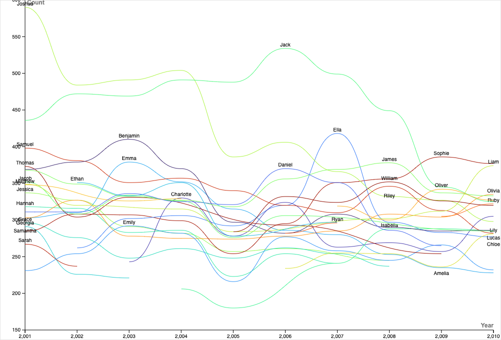
Using the most popular baby names in New Zealand from the 2001-2010 dataset, I decided to explore the trends of baby names with a line graph. This way, I could show the popularity rankings of different baby names throughout the years. Using a line graph was the most appropriate in this case because it allowed for easy comparison of multiple names over time, and you want to use a line graph when you are looking at trends over time. Next, I wanted to improve the clarity of my visualization, so I changed the color scale to have enough colors to assign a different color to each baby’s name. Thus, it makes it easier to distinguish between the different names. I also changed the width of the graph, so you can see how the popularity of different baby names changed over the full 10 years. In addition to this, I made sure to label everything clearly. The X-axis was the year, the Y-axis was the count, the lines were the name, and the color was the name as well. Before creating my graph, I read over the different charts in the Data Visualization Catalogue that Lin recommended. I did notice, however, that it is best to avoid so many lines on the graph and to divide the chart into smaller multiples. I tried implementing this approach, but the charts turned out all cluttered. My visualization relates to DH principles discussed in Lin’s lecture, in particular, as it shows the power behind data visualization. Using Digital Humanities principles discussed in Lin’s lecture, I was able to visualize the entire dataset over the whole period in one chart to uncover the patterns of popularity of the different names. Using these trends, I could see how naming conventions have changed over time or even potentially cultural shifts. Overall, this is tied to DH because it combines both humanistic inquiry for analyzing and interpreting data in insightful ways with data visualization.